Chapter 1 First cohort of FSHD and control plasma samples identifies complement components elevated in FSHD plasma
The first cohort consists of 24 FSHD and 12 control plasma samples. In this chapter, we compared the protein levels of complement components in FSHDs and controls from the first cohort. The tested complement components included six components of the classical/lectin activation pathway (C1q, C4, MBL, C4a, C2, C4b), four of the alternative pathway (Factor H, Factor I, Factor D, Factor B), and four of the terminal effector pathway (C3, C5, C5a, sC5b-9).
suppressPackageStartupMessages(library(tidyverse))
suppressPackageStartupMessages(library(wesanderson))
suppressPackageStartupMessages(library(ggrepel))
suppressPackageStartupMessages(library(kableExtra))
suppressPackageStartupMessages(library(knitr))
suppressPackageStartupMessages(library(ggfortify))
suppressPackageStartupMessages(library(broom))
suppressPackageStartupMessages(library(pheatmap))
suppressPackageStartupMessages(library(viridis))
suppressPackageStartupMessages(library(pheatmap))
suppressPackageStartupMessages(library(latex2exp))
pkg_dir <- "~/CompBio/Wellstone_Plasma_Complement_in_FSHD"
source(file.path(pkg_dir, "scripts", "tools.R"))
fig_dir <- file.path(pkg_dir, "figures")
cohort1 <- get(load(file.path(pkg_dir, "data", "table_1.rda")))
components <- c("C2", "C4b", "C5", "C5a", "Factor D", "MBL", "Factor I",
                "C1q", "C3", "C4", "Factor B", "Factor H",
                "C4a", "sC5b-9")
my_color <- viridis_pal(direction = -1)(8)[c(3, 6)] # control and FSHD
names(my_color) <- c("Control", "FSHD")
mean_color <- "#FF0000"
#my_color <- c(Control="#31A345", FSHD="#3182BD")
1.1 Demographic distribution
Age distribution of FSHD
cohort1 %>% filter(`pheno type`=="FSHD") %>%
  summarise(min=min(`Visit Age`), max=max(`Visit Age`),
            mean=mean(`Visit Age`), sd=sd(`Visit Age`)) %>%
knitr::kable(caption="FSHD: age distribution -- min, max, mean, and standard deviation. ")| min | max | mean | sd |
|---|---|---|---|
| 18 | 72 | 52.04458 | 14.88034 |
Age distribution of controls
cohort1 %>% filter(`pheno type`=="Control") %>%
  summarise(min=min(`Visit Age`), max=max(`Visit Age`),
            mean=mean(`Visit Age`), sd=sd(`Visit Age`)) %>%
knitr::kable(caption="Control: age distribution -- min, max, mean, and standard deviation.")| min | max | mean | sd |
|---|---|---|---|
| 21 | 63 | 45.33333 | 15.11972 |
Gender distribution of FSHD
cohort1 %>% filter(`pheno type`=="FSHD") %>%
  summarize(male = sum(`Sex` == "M") / nrow(.),
            female = sum(`Sex` == "F") / nrow(.)) %>%
knitr::kable(caption="FSHD gender distribution.")| male | female |
|---|---|
| 0.5 | 0.5 |
Gender distribution of Controls
cohort1 %>% filter(`pheno type`=="Control") %>%
  summarize(male = sum(`Sex` == "M") / nrow(.),
            female = sum(`Sex` == "F") / nrow(.)) %>%
knitr::kable(caption="Control gender distribution.")| male | female |
|---|---|
| 0.5 | 0.5 |
1.2 Statistics testing
The \(t\)-test comparing FSHDs and controls rendered three components, sC5b-9, C3, and C2, showing increased levels in FSHD. The code chunks below perform
- \(t\)-testing comparing the complement components in FSHD and control groups
- barplot of p-values (Figure 1.1; Fig. 2a) and complement levels distribution in each group (Figure 1.2; Fig. 2b)
- heatmap and hierarchical cluster analysis (Figure 1.3; Suppl. Fig. S1)
# use .tidy_names() from scripts/tools.R" to tidy the name of cohort1
cohort1_tidy <- .tidy_names(cohort1) %>%
  select(-Bb) %>%
  select(`sample ID`, pheno_type, all_of(components)) %>%
  gather(key=complement, value=ml, -`sample ID`, -pheno_type)

cohort1_tidy_norm <- cohort1_tidy %>%
  group_by(complement) %>%
  group_modify( ~.z_norm(.x))
1.2.1 t-tests
cohort1_ttest <- cohort1_tidy %>%
  mutate(pheno_type = factor(pheno_type)) %>%
  group_by(complement) %>%
  spread(key=pheno_type, ml) %>%
  summarize(control_mu = mean(Control, na.rm=TRUE),
            control_sd = sd(Control, na.rm=TRUE),
            FSHD_mu = mean(FSHD, na.rm=TRUE),
            FSHD_sd = sd(FSHD, na.rm=TRUE),
            #wilcox_test = wilcox.test(FSHD, Control)$p.value,
            t_test = t.test(FSHD, Control)$p.value,
            t_stats = t.test(FSHD, Control)$statistic) %>%
  mutate(log10Pval = -10 * log10(t_test)) %>%
  mutate(log10Pval = ifelse(t_stats < 0, -log10Pval, log10Pval)) %>%
  mutate(candidate = ifelse(t_test < 0.05, "Yes", "No")) %>%
  arrange(desc(t_test)) %>%
  mutate(complement=factor(complement, levels=complement)) %>%
mutate(formated_p = format(t_test, digits=1))ggplot(cohort1_ttest, aes(x=complement, y=log10Pval, fill=candidate)) +
geom_bar(stat="identity", width=0.7, show.legend=FALSE) +
coord_flip() +
scale_fill_manual(values=c("#999999", "#E69F00")) +
theme_bw() +
labs(title=TeX("First cohort: $t$-tests"), x="Complements",
y=TeX("$-10\\log_{10}(\\mathit{p}-val) \\times sign(\\mathit{t}-stats)$")) +
#y=expression(-10*Log[10](p-value) %*% sign(t-stats))) +
geom_text(aes(label=formated_p), vjust=0.5, hjust=0.5, color="gray10",
position = position_dodge(1), size=2.5) +
theme(panel.grid.major = element_blank())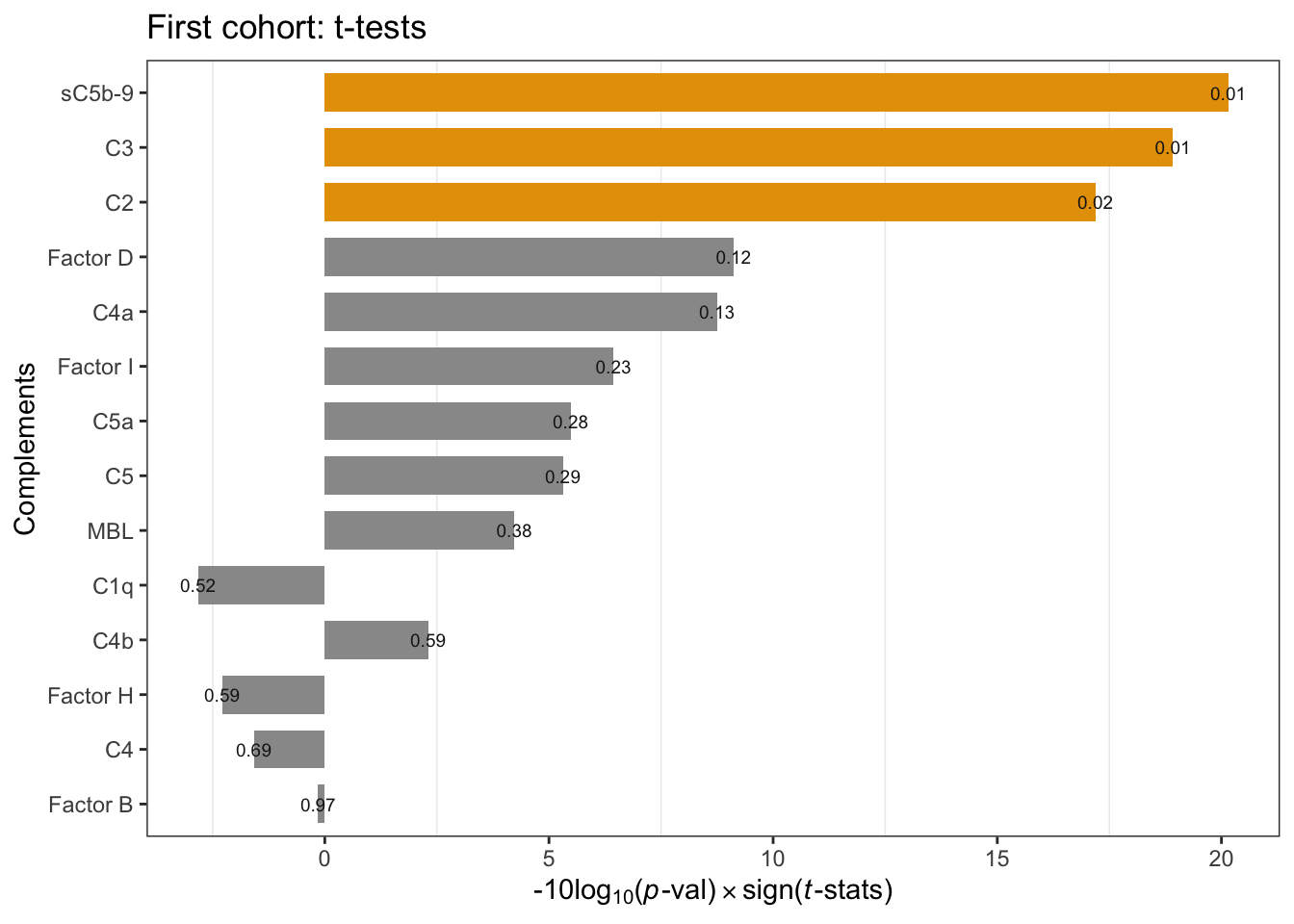
Figure 1.1: Cohort1 per-compoment t-tests: FSHD vs. controls. Annotation refers to p-values. * negative -10Log10(p-value) indicates negative t-statistics.
1.2.2 Violin plot of 14 complement components measurements
cohort1_tidy %>%
  ggplot(aes(x=pheno_type, y=ml)) +
    geom_violin(aes(color=pheno_type), width=0.7) +
    geom_dotplot(binaxis='y',
                 stackdir='center', dotsize=1,
                 aes(color=pheno_type, fill=pheno_type),
                 alpha=0.7, show.legend=FALSE) +
    stat_summary(fun=mean, geom="point", shape=23, size=2.5,
                 color="#FF0000") +
    theme_minimal() +
    labs( y=expression(mu*g / ml),
          title="First cohort complement components") +
    facet_wrap(~ complement , scale="free", nrow=3) +
    scale_fill_manual(values=my_color) +
    scale_color_manual(values=my_color) +
    theme(legend.position=c(0.9, 0.15),  legend.key.size = unit(0.4, 'cm'),
          axis.title.x=element_blank(), axis.text.x=element_blank())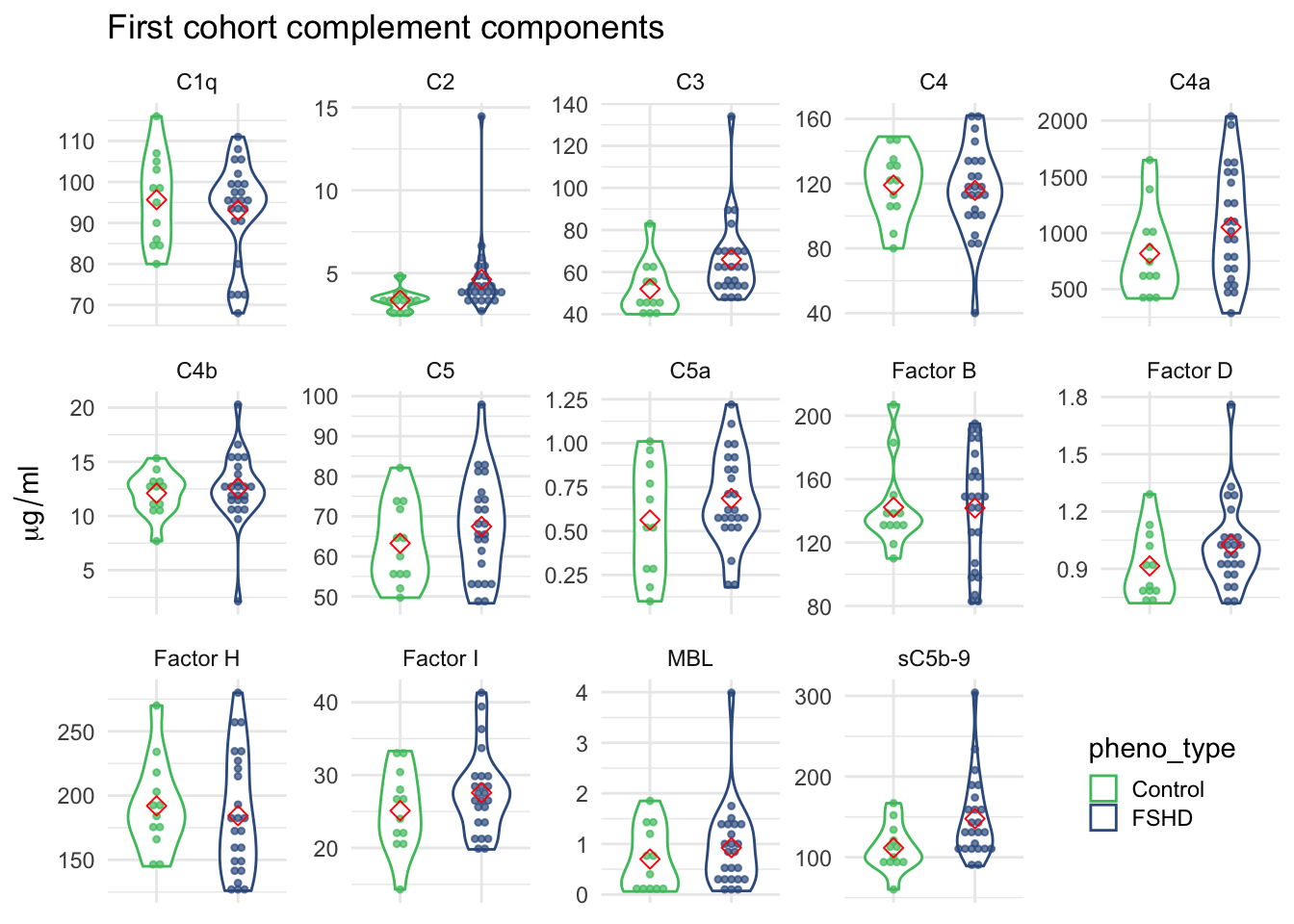
Figure 1.2: 14 complement components measurements grouped by FSHD and control samples.
1.2.3 Heatmap and cluster analysis
norm_data <- cohort1_tidy_norm %>%
  select(-ml) %>%
  spread(complement, ml_norm)
# outlier F11's C2 = 14.46, replace with NA to avoid the color skew
norm_data[which(norm_data$`sample ID` =="F11"), "C2"] <- NA
mat <- norm_data %>% select(-`sample ID`, -pheno_type) %>% as.matrix()
rownames(mat) <- pull(norm_data, `sample ID`)

# annotation
annotation_row <- data.frame(pheno_type=factor(pull(norm_data, `pheno_type`)))
rownames(annotation_row) <- rownames(mat)
annotation_colors <- list(pheno_type=my_color)
# heatmap
pheatmap(mat, annotation_row=annotation_row,
         scale="none",
         fontsize=10,
         annotation_colors=annotation_colors)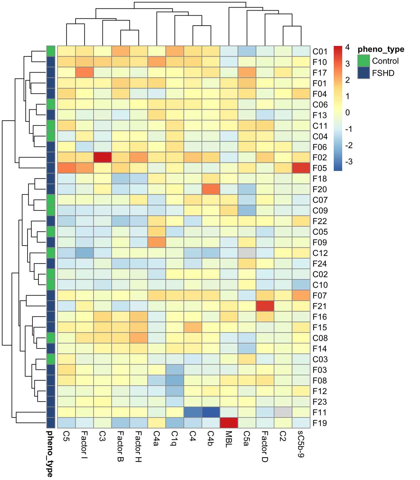
Figure 1.3: Cohort1: heatmap of the normalized matrix.