Getting to know the people who use my data: a brief intro to UX research
Written by: Helen Miller - Software Development Engineer
About a year and a half ago, shortly after I started working at Fred Hutch, I took on redesigning part of the user interface on the website I work on: ImmuneSpace. ImmuneSpace is a public data portal which holds biological assay data from over 100 different studies, and includes tools for visualizing and analyzing, and downloading it. I like working with public data. I think data sharing and public data portals can be really useful to science. But it can be frustrating sometimes too. For public data to be useful, it has to be well-documented and accessible. And as there’s more and more of it, the challenge of even finding something useful becomes more daunting.
My redesign of our user interface was meant to help users do just that: find data.
Turns out, to do that well, I needed to venture into some unexpected territory. It involved watching people click around the website and asking them a lot of questions, lots of whiteboarding, sticky notes of every color, debating design ideas, online shopping. I had to understand people and how they think, not just the data they want to access.
So what do the people want?
To start off, I had to figure out what my users even wanted. So I asked them: When you’re looking for data, what kinds of variables do you look for to tell if it will work for you? What kinds of plots do you like to use to understand your data? That part was pretty straightforward. It didn’t take long to get an idea of how people might like to filter the data, and how to show them the results of those filters through summary statistics and visualizations.
Usability testing
Next, I had to figure out how to actually design the interface to include those things, and so that users could interact with it and understand what’s happening. I needed to get an idea about how they think about my website. Luckily, there is already a whole field of study around how to do this. It’s called User Experience (UX) research. So I asked a UX expert what to do, which is where I learned about usability testing. Usability testing is about understanding how a user interacts with your tool, and how to make it “usable.” Here’s a super quick overview of how it works:
- Come up with some scenarios: ways users might interact with your website.
- Ask some people to walk through those scenarios. 4 or 5 people is plenty.
- As they walk through the scenarios, have them explain why they click where they click and look where they look etc. If they don’t tell you, ask. “why did you do that? why did you click there? why did you scroll there? why aren’t you clicking anywhere…?” Channel your inner 3-year-old.
- Try not to interfere! Let them interact with the site and observe.
- I found it really helpful to practice on some friends.
When I did this, some users surprised me! When you let people just go off on their own you learn a lot more about what they want than if you just asked them. I saw them do things I wouldn’t have expected, ask questions I wouldn’t have thought of, and look for things I wouldn’t have looked for.
Analyzing qualitative feedback
The kinds of data I got from usability testing and user research were a lot different from the quantitative data I’m used to. Luckily, smart UX researchers have developed all sorts of techniques for analyzing it. Here’s where the sticky notes come in. I pulled in my team members to do some affinity mapping. Affinity mapping is a tool for sorting ideas into groups. You can use it to extract meaning and patterns from qualitative data. Here’s how I used affinity mapping to analyze my usability testing results:
- Write down each individual piece of feedback on separate sticky notes. I color coded them based on the person who said it.
- Call some friends in for help. This is a great place to involve teammates or stakeholders. Everyone gets a stack of sticky notes, and sticks each note on the board one at a time, trying to keep similar notes near each other. You can define categories ahead of time, or let them form organically. I started with some very vague categories to get started but they can shift.
- Once all the notes are on the board, examine your different categories to identify patterns.
Design
So now that we have some ideas of things to change, I had to come up with a design to fix the problems. This involved a lot of whiteboarding, examining other data portals and e-commerce sites (there’s that online shopping I mentioned — I promise it was for research!), and mocking up designs on google slides. We asked for some advice from our UX design expert once again at this point, who had suggestions about things like nav trails, how to group information, where to match colors to convey information, the importance of white space. I tried out a technique called card sorting which is similar to affinity diagramming to figure out how to group different parts of the web page.
And then I iterated…. get feedback, analyze it, design, prototype, repeat. You can use the final product (for now) to explore datasets on immunespace.org. Full disclosure: you will be required to make a free account by providing your email and some basic user information to access it. If making an account isn’t your thing, thats ok! You can see images of the original datafinder, an intermediate prototype, and the current datafinder below.
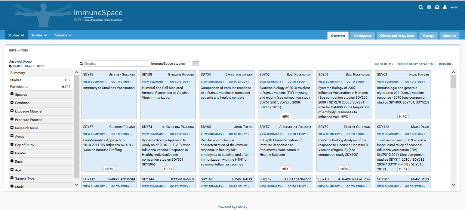
Original Datafinder:
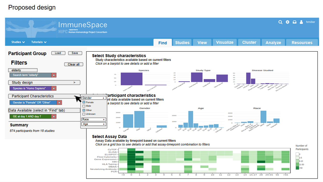
Prototype Datafinder:
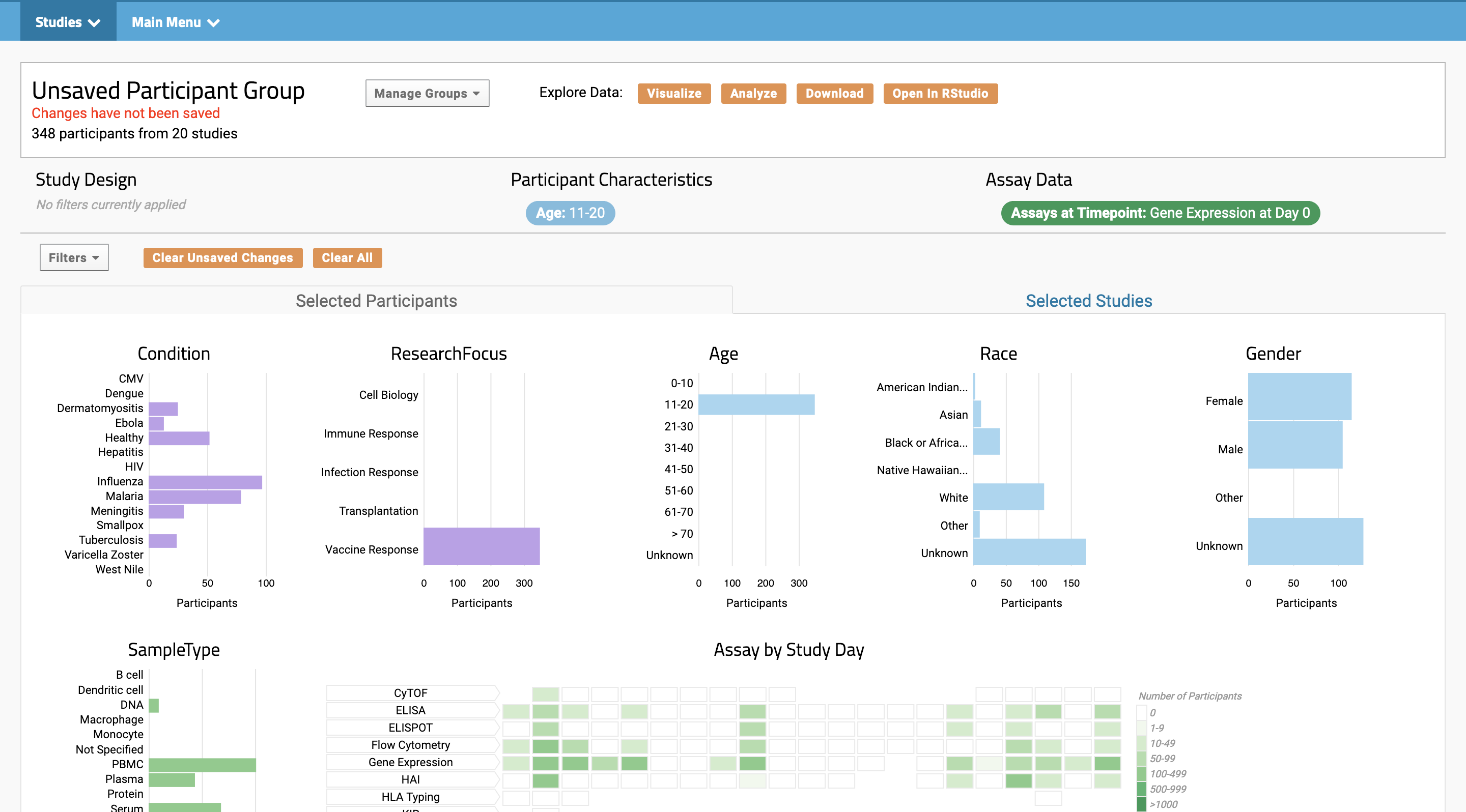
Current Datafinder:
It was sure a lot more work than I expected! It’s easy to iterate and update design when I, the developer, look at the site and think “I think this would make it better!” But when I took the time to see how users interacted with it, I got some surprises. You can’t give the users what they want or what they need unless you ask them!
So why bring UX research into science?
Let’s go back to our relationship with data. We spend an incredible amount of time, mind power, and money on storing, cleaning and analyzing it. This is all pointless unless we can effectively share it, interrogate it, and communicate its stories. Big Tech Companies spend a lot of money on building slick user interfaces to allow people to understand their products. I think we can borrow some of their ideas when it comes to building tools to allow people to understand our data.
The field of UX research was totally new to me when I started this project. I didn’t even really know it was a thing. Turns out it’s a really big thing and it can be really useful! I was surprised by how much I was able to learn by engaging our users a bit more, and experimenting with some UX research techniques to take a closer look at how people want to use it. I only scratched the surface of UX research. There are all sorts of tools and techniques out there for understanding users and designing to fit their needs. But it doesn’t require degree in UX research to find out how to make your tools more useful or how to better communicate your data.
Are slick user interfaces required for scientific discovery? Of course not! Scientists are resourceful. But if they can spend more time looking at results and less time sorting through mountains of data, those scientific discoveries will come a lot more easily. As a developer of public data portals, my goal is to create tools for so that people can easily find and understand data that will answer their scientific questions. Through the process of redesigning ImmuneSpace’s data finder tool, I learned that I can’t effectively do that without first getting to know the people who might use it, and how they think.